- Compatible XF Versions
- 2.1
- 2.2
Demo: XenTR / Professional XenForo Styles : Default-Style
Note: On the demo site, the style switcher plug-in is only set to default style.
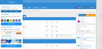
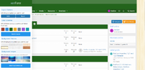
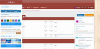
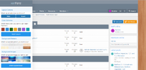
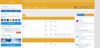
This add-on is a jQuery-based theme / skin modifier that allows a visitor to change the look of your webpage (for example, text color, background color, background image) from the sliding panel.
Installation:
- XENTR-StyleSwitcher-1.0.0.zip and unzip it.
- Copy the upload/src/addons/XENTR/StyleSwitcher directory to your server.
- The directory where the Javascript files will be located: upload/js/xtr/style_switcher
- Pattern and Background images directory: upload/styles/xtr/style-customizer
- From the Admin Control Panel Install the add-on.
- You can check the options from /admin.php?options/groups/xtr_styleSwitcher/ and set.
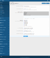
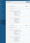
- Make settings from the Style properties page. admin.php?styles/your-style/style-properties/group&group=xtr_style_switchers
- Wide and boxed layout option
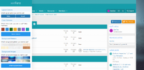
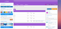
- 7 different custom color pickers Red, Blue, Green, Yellow, Slate, Violet, Teal
- 8 custom pattern picker,
- 8 custom background selector,
- Custom Cookie Script,
- Automatic reset buttons,
- Ability to select user groups,
- Option to use on the specified theme,
- Fully manageable style feature,
- Modern Browser Compatibility
- More options.
After installing the plug-in seamlessly, you can see the codes that change the colors of some fields by default on the style properties page.
Main red color palettes check the backgrounds to be displayed in red in the color code specified in this area.
Sub red color palettes determine the color and of the links and description fields to be displayed on the red background.
Example codes:
Only red color tones are given here.
Red colors BG classes value: You will see the following codes in this field.
Code:
[xf="red"] .style-customizer a.opener,
[xf="red"] .style-customizer .custom-logo,
[xf="red"] .style-customizer .button-border,
[xf="red"] .style-customizer a.button.button-border,
[xf="red"] .p-header,
[xf="red"] .p-nav,
[xf="red"] .p-nav-list .p-navEl.is-menuOpen,
[xf="red"] .p-navgroup-link.is-menuOpen,
[xf="red"] .p-footer,
[xf="red"] .p-body-main .block-header,
[xf="red"] .block-minorHeader
There is a prefix code that you need to use for each field where you want to change the color.
[xf = "red"] you must put this code in front of the css format you want to change.
You need to follow the same procedure for other shades.
If you want to apply the same color tones to your areas with different color tones, you can use the similar codes given below in the extra.less template.
Example code:
Code:
[xf="red"] .p-staffBar {
    background: fade(xf-default(@xf-xtr_color_schemes_red_background, transparent), 80%);
    color: fade(xf-default(@xf-xtr_color_schemes_red_color, transparent), 80%);
    border-bottom: @xf-borderSize solid rgba(255, 255, 255, 0.15);
}
[xf="red"] .p-staffBar a {
    color: fade(xf-default(@xf-xtr_color_schemes_red_color, transparent), 80%);
}
[xf="red"] .p-staffBar-link:hover {
    background: {{ property('xtr_color_schemes_red_background') }};
}
As you can see in the example above, there are three different colors in the Staff Bar area. Background, - Color and Border Bottom. With this example, you can make color changes for the fields you want to change.
Note: If you share the color codes that you have developed under this source topic, I can add the codes you have given to future updates on the plugin.
Please specify your evaluations about the add-on.
