- Compatible XF Versions
- 2.1
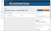
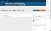
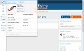
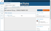
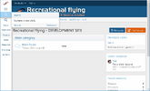
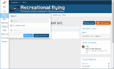
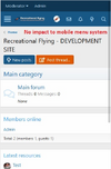
This modification replaces the standard horizontal below header menu system with a side column menu system with the user being able to select its display on either the left or right of the screen.
It provides for a greater number of main menu items with increased real estate to display more of what your site may have to offer a user...stops the "Out of site, Out of mind" use of extra site features and sections you offer.
The modification includes 4 components:
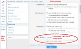
1. A Custom User Field - to allow the user to select right side of screen menu display, default is Left
2. A change to 1 setting - to make the sub menu sticky across the top of the page
3. A new css template - to set the display parameters of the side column menu
4. A modified PAGE_CONTAINER template - to create the side column and display the main menu
NOTES:
1. This is FREE to use but it is still owned by me. This is to prevent anyone from charging anyone else for it or components of it...I have released this to help others if they wish to use it and not for commercial interest
2. I am not a developer so I can help when I can and how I can however I am hoping that we can all help each other with enhancing this modification for the benefit of everyone so please if you change anything in it, let others know.
3. Due to the need to modify the PAGE_CONTAINER template there may be impacts to other addons that automatically overwrite elements in the PAGE_CONTAINER template. It is important to note that the changes I have made to the PAGE_CONTAINER are commented beginning with "IB" in the template
4. This has been tested on a standard XF install with the default style, 3rd party styles may impact this modification
Step 1 - Add Custom User Field
a. In the ACP (Admin Control Panel) go to Users -> Custom user fields and then "Add Field"
b. Complete these fields:
Field ID = menu_position
Title = Menu Position
Display location = Preferences
Field type = Check boxes
* Then under "Options for choice fields" *
Possible choices:
Value = 1
Text = Right
* Then under "General Options" select what you like *
Click "Save" to save the Custom Field
Step 2 - Change the Sticky Navigation setting
a. In the ACP go to Appearance -> Style properties and then select "Header and Navigation"
b. Select the "Sticky navigation element" option to "Primary navigation row only"
Step 3 - Create the new css template NOTE - it must be called nav_side_menu.less
a. In the ACP go to Appearance -> Templates and click Add template
b. Enter in the Template name field nav_side_menu.less
c. Copy the following css and paste it into the code box beneath the Template name field
d. Click Save and Exit
Step 4 - Modify the PAGE_CONTAINER template
a. In the ACP go to Appearance -> Templates, find the PAGE_CONTAINER template and click on it to open
b. Note any changes you may have manually made to this template as you will need to add them back in afterwards
d. Copy the code in the attached PAGE_CONTAINER text file and paste it over ALL the existing code in the template:
NOTE - you will notice my changes have been commented
e. Click Save and Exit
TEST TEST TEST
It provides for a greater number of main menu items with increased real estate to display more of what your site may have to offer a user...stops the "Out of site, Out of mind" use of extra site features and sections you offer.
The modification includes 4 components:
1. A Custom User Field - to allow the user to select right side of screen menu display, default is Left
2. A change to 1 setting - to make the sub menu sticky across the top of the page
3. A new css template - to set the display parameters of the side column menu
4. A modified PAGE_CONTAINER template - to create the side column and display the main menu
NOTES:
1. This is FREE to use but it is still owned by me. This is to prevent anyone from charging anyone else for it or components of it...I have released this to help others if they wish to use it and not for commercial interest
2. I am not a developer so I can help when I can and how I can however I am hoping that we can all help each other with enhancing this modification for the benefit of everyone so please if you change anything in it, let others know.
3. Due to the need to modify the PAGE_CONTAINER template there may be impacts to other addons that automatically overwrite elements in the PAGE_CONTAINER template. It is important to note that the changes I have made to the PAGE_CONTAINER are commented beginning with "IB" in the template
4. This has been tested on a standard XF install with the default style, 3rd party styles may impact this modification
Step 1 - Add Custom User Field
a. In the ACP (Admin Control Panel) go to Users -> Custom user fields and then "Add Field"
b. Complete these fields:
Field ID = menu_position
Title = Menu Position
Display location = Preferences
Field type = Check boxes
* Then under "Options for choice fields" *
Possible choices:
Value = 1
Text = Right
* Then under "General Options" select what you like *
Click "Save" to save the Custom Field
Step 2 - Change the Sticky Navigation setting
a. In the ACP go to Appearance -> Style properties and then select "Header and Navigation"
b. Select the "Sticky navigation element" option to "Primary navigation row only"
Step 3 - Create the new css template NOTE - it must be called nav_side_menu.less
a. In the ACP go to Appearance -> Templates and click Add template
b. Enter in the Template name field nav_side_menu.less
c. Copy the following css and paste it into the code box beneath the Template name field
CSS:
@media (min-width: 651px) {
    .menu_right {margin-right:72px;}
    .menu_left {margin-left:72px;}

    .p-navSticky {
        position: fixed !important;
        width: 72px;
        top: 0 !important;
        right: 0;
        bottom: 0 !important;
        overflow: auto;
        background: #fff;
        box-shadow: 0 0 8px 3px rgba(0,0,0,0.3);
    }

    .side_menu_sticky{
        position: fixed;
        top: 0;
        width: 100%;
        z-index: 99;
    }

    .side_left_nav.p-navSticky {
        left: 0;
        z-index: 1000;
    }

    .p-nav-list>li , .p-navgroup-link , .p-nav-inner{
        display: block;
    }

    .p-navgroup , .p-navgroup-link {
        float: none;
        text-align: center;
    }

    .p-nav-list .p-navEl.is-selected .p-navEl-link , .p-nav-list .p-navEl-link , .p-navgroup-link {
        width: 100%;
        text-align: center;
        color: #185886;
        font-size: 11px;
    }
    .p-nav-list .p-navEl-link--splitMenu, .p-nav-list .p-navEl-splitTrigger {
        width: 100%;
        text-align: center;
        padding: 8px 0 8px 2px !important;
        font-size: 11px;
        font-family: 'Droid Sans', sans-serif;
    }

    .p-nav-list .p-navEl-splitTrigger  {
        width: 25%;
        color: #185886;
        font-size: 13px;
        text-align: center;
    }

    .p-navgroup {
        background: none;
    }

    .p-nav-opposite {
        text-align: center;
        margin-right: 0px;
    }
    .p-nav {
        color: #185886;
        background: transparent;
    }
    .p-navgroup-link.badgeContainer {
        font-size: 13px;
    }

    .p-navSticky--primary.is-sticky .p-nav-list .p-navEl-link.p-navEl-link--splitMenu ,
    .p-nav-list .p-navEl-link.p-navEl-link--splitMenu {
        padding-right: 15px;
    }
    .menu--account {
        top: 0px !important;
    }

    [data-load-target=".js-convMenuBody"] {
        top: 40px !important;
    }

    [data-load-target=".js-alertsMenuBody"] {
        top: 74px !important;
    }

    .menu--account , [data-load-target=".js-convMenuBody"] , [data-load-target=".js-alertsMenuBody"]  {
        right: 72px !important;
        left: initial !important;
    }

    .menu.menu--structural.side_search_menu {
        right: 72px !important;
        left: initial !important;
        margin-top: -30px;
    }

    .menu_position_left .menu--account , .menu_position_left [data-load-target=".js-convMenuBody"]
    , .menu_position_left [data-load-target=".js-alertsMenuBody"] , .menu_position_left .menu.menu--structural.side_search_menu  {
        left: 72px !important;
    }
    .p-navgroup-link.badgeContainer:after {
        left: 45px;
    }
    .badgeContainer:after {
        word-break: break-all;
        margin-right: 1px !important;
    }
    a.p-navgroup-link.p-navgroup-link--iconic.p-navgroup-link--whatsnew , .p-nav-list .p-navEl-splitTrigger
    , span.menu-arrow , .hScroller-action ,.p-navgroup-link.p-navgroup-link--iconic .p-navgroup-linkText, .p-navgroup-link.p-navgroup-link--textual i ,
    .p-navSticky--primary.is-sticky .p-nav-list .p-navEl.is-selected .p-navEl-splitTrigger  , .p-nav-scroller .hScroller-action.hScroller-action--end{
        display: none !important;
    }
    .p-sectionLinks-list .p-navEl-link.p-navEl-link--splitMenu {
        padding-right: 6px;
    }
    .p-navgroup-link--iconic i {
        font-size: 18px;
    }
    .p-navgroup-link {
        padding-top: 4px;
        padding-bottom: 4px;
    }
    .p-navgroup-link:hover ,.p-nav-list .p-navEl:not(.is-selected):not(.is-menuOpen):hover,
    .p-nav-list .p-navEl:not(.is-selected):not(.is-menuOpen) .p-navEl-link:hover,
    .p-nav-list .p-navEl:not(.is-selected):not(.is-menuOpen) .p-navEl-splitTrigger:hover {
        background: rgb(199, 221, 243);
    }
    .p-navgroup.p-discovery {
        margin-left: 0em;
    }
    .p-navgroup-link {
        border-left: 0px solid rgba(20, 20, 20, 0.15);
    }
    .p-nav-list .p-navEl-link {
        padding: 8px 5px;
        white-space: normal;
    }
    .p-navgroup-link.p-navgroup-link--user .avatar {
        width: 32px;
        height: 32px;
        font-size: 19px;
        line-height: 32px;
    }
}

@media (max-width: 650px) {
    .menu_right {margin-right: 0px;}
.menu_left {margin-left: 0px;}Step 4 - Modify the PAGE_CONTAINER template
a. In the ACP go to Appearance -> Templates, find the PAGE_CONTAINER template and click on it to open
b. Note any changes you may have manually made to this template as you will need to add them back in afterwards
d. Copy the code in the attached PAGE_CONTAINER text file and paste it over ALL the existing code in the template:
NOTE - you will notice my changes have been commented
e. Click Save and Exit
TEST TEST TEST
