Here’s why you're losing sales every day...
Default checkout is not user-friendly & conversion-focused
You cannot add, remove, edit or even re-order form fields without getting help from your developer. This is a major limitation.
They do not persuade with testimonials, guarantee & FAQs
Users experience anxiety and fear on the checkout page. Sections like testimonials, support and guarantee help pacify those negative feelings around online buying.
Default checkouts are not optimized for mobile
50.3% of traffic comes from mobile. Most users never complete their purchase on a single device, they switch midway. Isn't it high time to optimize for mobile?
Checkout pages designed to convince and convert prospects
Here's how Aero helps you lock in more sales from the same traffic
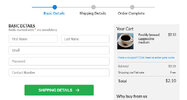
Create a multi-step checkout form with progress indicator to minimize friction
A long checkout form looks intimidating at the first glance. But if you break it into multiple steps, you can collect the basic details first followed by billing and shipping. The advantage of this approach is that people keep moving forward one step at a time. It’s like a slippery slope.
Use product & quantity selector to give the control to users
You can append a mini cart on the checkout page. Let users delete and recover deleted items. Give them the option to adjust the quantity of the item(s) they’re buying. It’s not just great for your conversions but also your order value!
Persuade prospects with credible proof
It’s a misconception that people go to the checkout page to swipe the card. They still have last-minute doubts about buying. And are still thinking whether they’re making the right decision. The best way to combat it is to show credible proof in form of testimonials and reviews.
Win their trust with a section on support
Before placing the order, shoppers want to know if you’ll be available for help later. They may not even use these contact details but just having them – makes a world of a difference. It also adds a nice human touch to the most important page on your store.
Show the reasons to believe in crisp bullet points
Use the ‘why buy from us’ section to give them reasons to push the buy button. May be you donate a part your income to charity or feed homeless dogs or use 100% organic materials or you ship all orders next business day.
Embed the checkout form on a landing page
Aero gives you shortcodes to embed the checkout form on a landing or a sales page. Shoppers can checkout way faster without having to go through the typical cart. You can direct traffic to this single page funnel.
